Dreamy by Design
August 14th, 2024Behind Babylonstoren #8: Susan Brand
“What do you love about Babylonstoren?”
The answer frequently includes delight at our garden, followed by admiration for our beautiful packaging. From the distinctive logo and our love of Delft to the exact shade of Babylonstoren blue that courses through everything like an artery of stylistic intent – it’s clear that the curation of our brand identity is a labour of love that demands extraordinary focus.
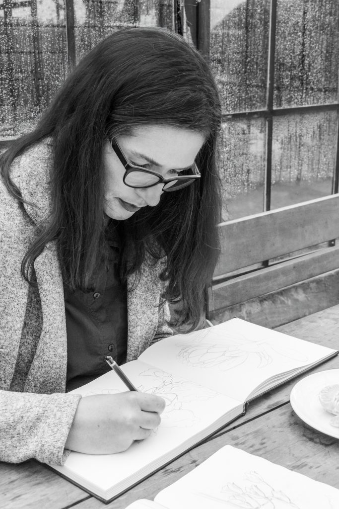
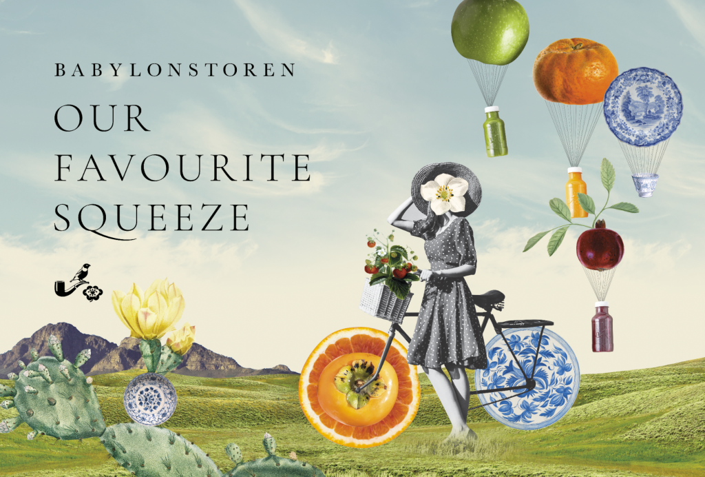
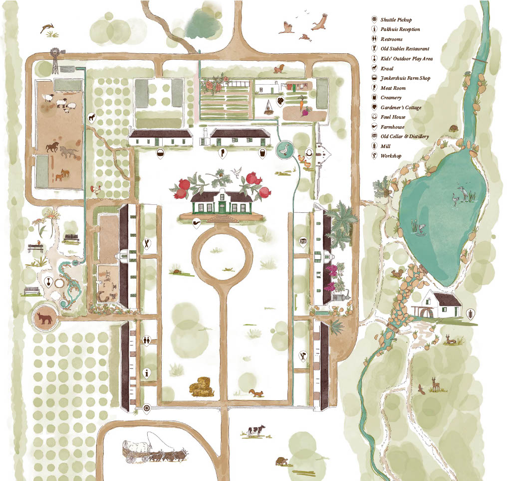
As Head of Design, Susan Brand’s visual dexterity is flexed across a multitude of applications, from hand-drawn maps and playful, digital pastiche, to beautiful yet functional and sustainable packaging solutions.
Growing up in the verdant hills of Northern KwaZulu-Natal, Susan had the freedom to explore the misty, magical mountains behind the family home, looking for rocks, plants and birds. She laughingly describes herself as “not exactly a child protégé”. Despite a mean Grade 1 teacher who ridiculed an early artwork, her mom’s beautiful garden and a granny with an artistic soul put the budding artist on her way. Plus, sometimes when you luck out, it leads to a lucky break. “I was bad at piano, so my parents sent me to watercolour classes, which were amazing,” recalls Susan.

Lessons learnt here about colour blending still prove valuable today. In high school she exchanged her watercolours for acrylics and oils, before studying graphic design at Potchefstroom University.
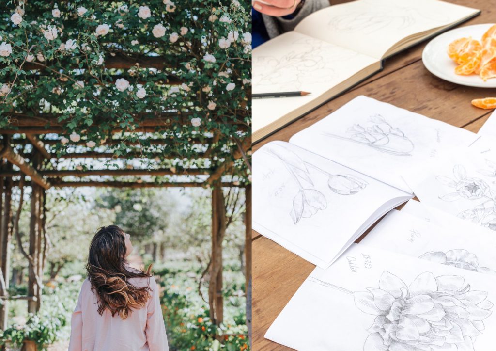
“Graphic design has a more entrepreneurial edge than fine arts,” says this mom of two who freelanced for a decade before joining Babylonstoren in August 2021. “The creative collaboration in a team is wonderful. I really don’t want to work on my own again.” She also embraces the challenge of being super creative within the borders of a brand’s identity.
“Because we work in print and digital, it does get extremely technical in terms of specifications, materials and executions. Some days it’s just barcodes all day long,” she says. Simplicity is a way to stand out. “It’s harder, as there is nowhere to hide. Loud branding can be exhausting, so I tend to keep it calm.”
Susan’s Design Rules
- Do not clutter.
- Breathing space is important.
- Choose simplicity, especially in packaging.
- When in doubt, revert to the Golden Ratio. “When I struggle to place elements in a design, I use a grid and the principle of the Golden Ratio to guide me.”
She is currently studying a course in packaging technology. “It’s crucial to know all there is to know about packaging. Like the technical specs with labels, outside of the design aesthetics; does it need wet and dry functionality, will the label be frozen … A product without a label cannot be sold. So, you need to consider its durability.” Her studies include the all-important topic of sustainable packaging. “People expect Babylonstoren to protect the environment – as I also want to do – so you need to know what you’re talking about.”
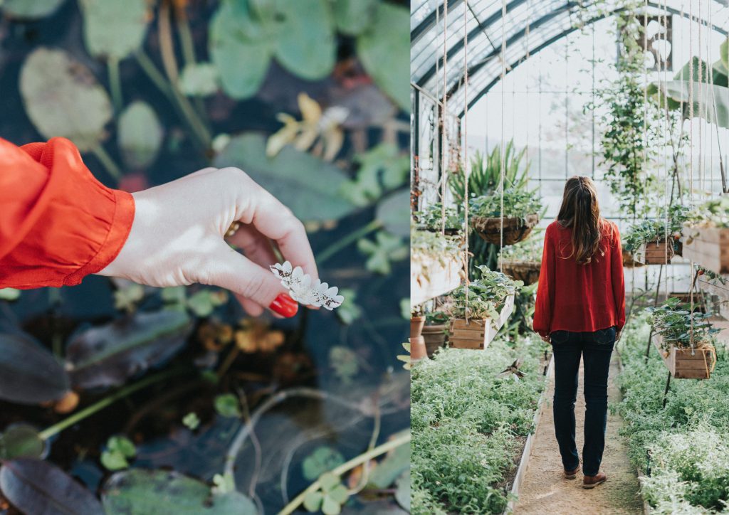
The volume and scope of design work at Babylonstoren keep Susan and her colleague, Marianne Cronjé, on their toes. “But inspiration is everywhere in the garden. It’s easy to assimilate a mood board on the farm. I prefer not to use an image from the internet. The owners of Babylonstoren have embedded so much into the farm, I still discover detail and hidden elements that haven’t been seen before,” she enthuses.
Being grounded by nature is something Susan encourages. “She’s so brilliant at capturing the character of Babylonstoren because she absolutely loves the brand. She often reminds me to take a walk in the garden and find inspiration there,” says Marianne.
Susan’s Top 5
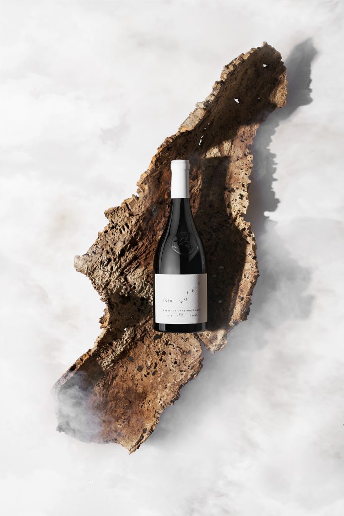
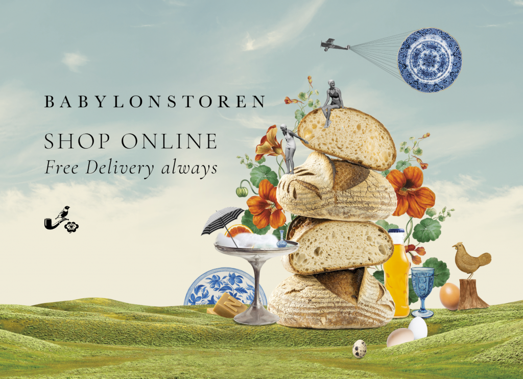

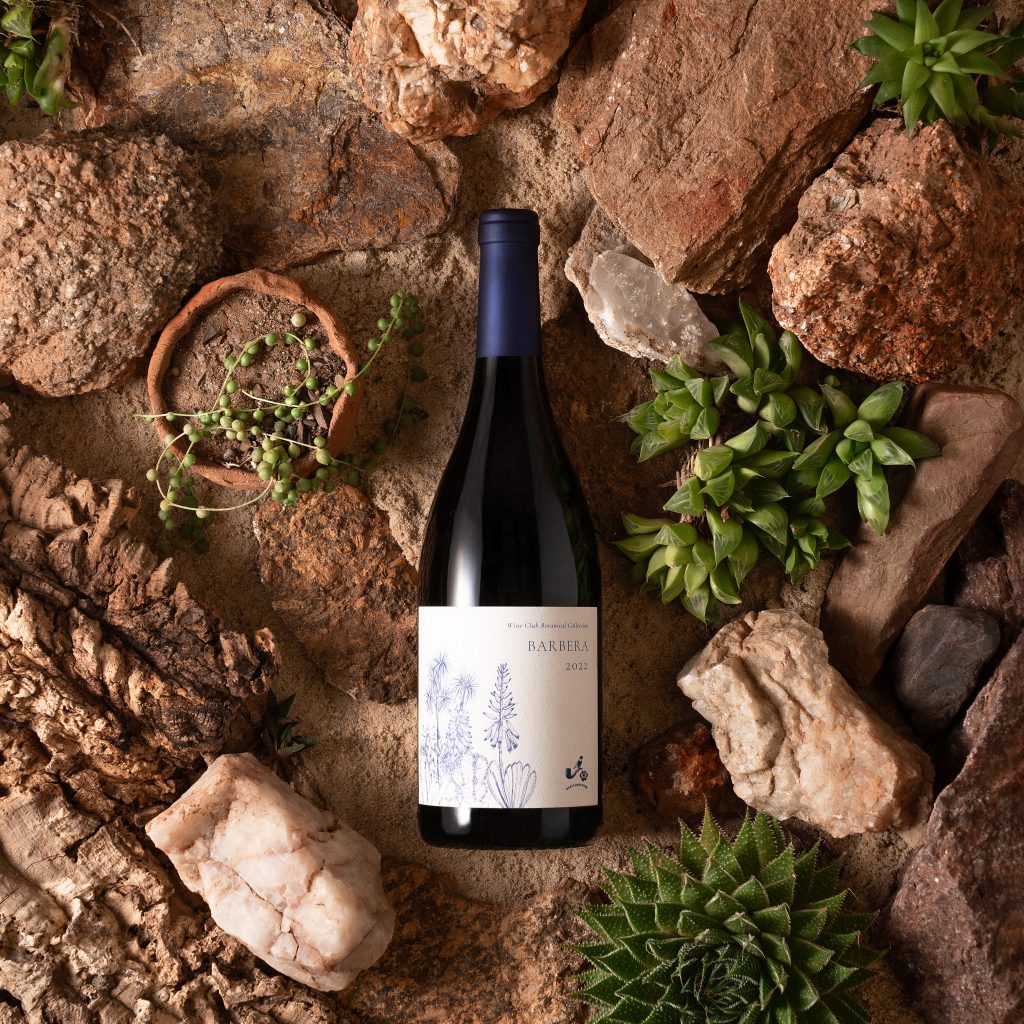
That’s 6. We know. But why force her to choose between children?
